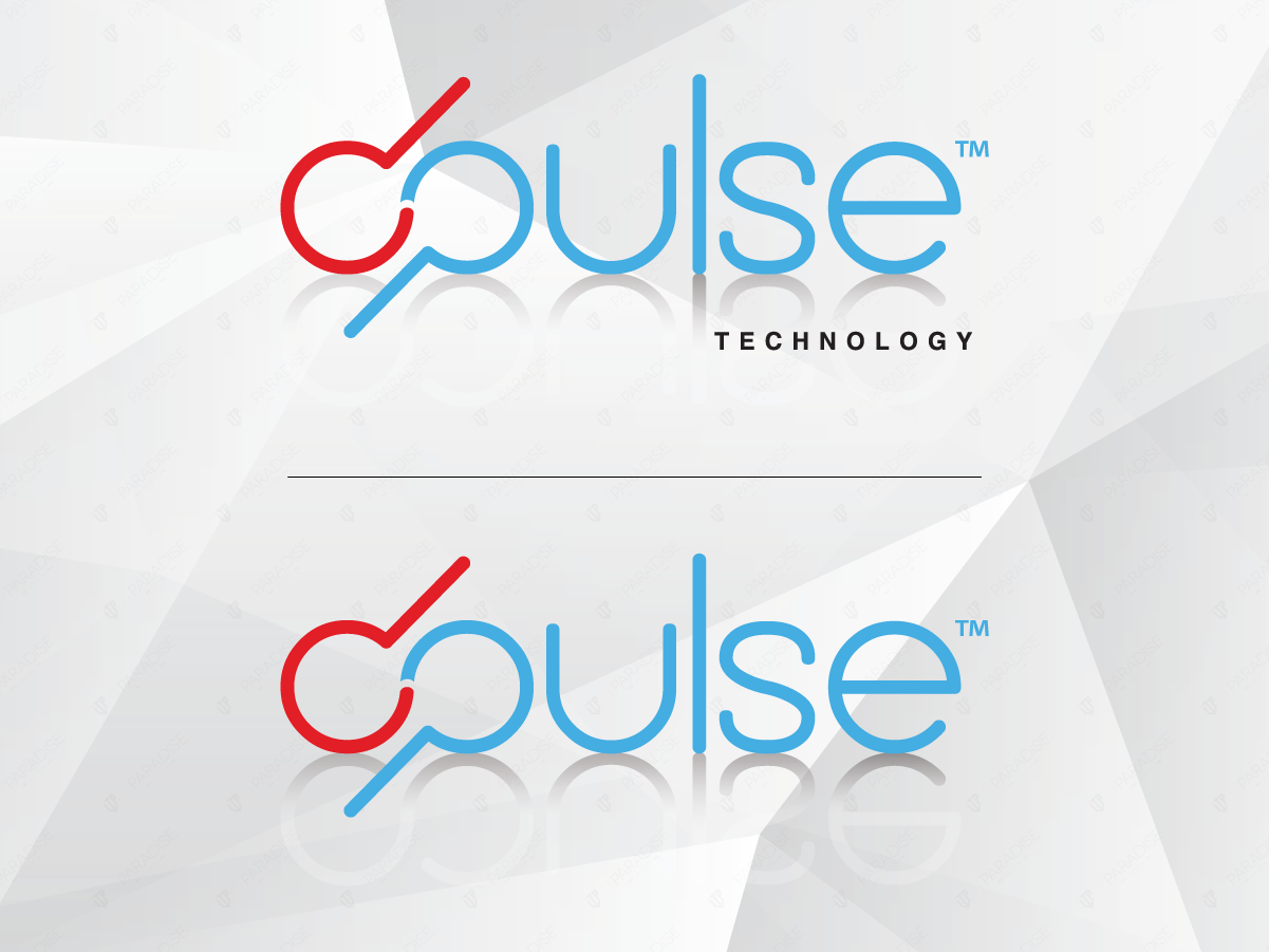
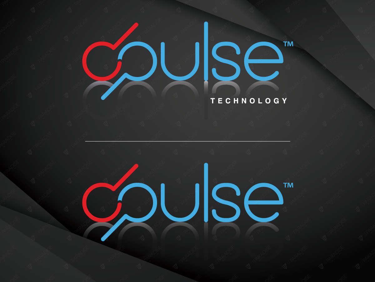
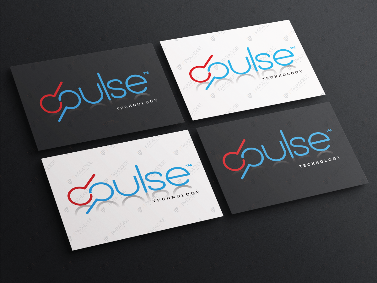
As a technology company, DPulse’s brand identity is centered around the idea of electronics-based including business relating to digital electronics. softwares and internet-related services. IT Paradise helped to create a logo in the form of logotype that reflects the company’s name with no symbols, graphic pattern or emblems.
We designed a logo that is modern yet simple enough that can be scaled down or up and still looks good. The logo consists of two basic colors which were blue and red that represents the ambitions and strength of the company. We aimed for colors that resonate with customers while remaining sufficiently different from competitors.


